I recently replaced the logo on the top left corner with an animated SVG:
Inspiration #
The first time I saw such stroke animations in SVG is the Material Line Icons by Vjacheslav Trushkin. It was cool, but I never thought about making one my own until I saw Mu-An Chiou’s banner on her website. I suddenly feel like I want to be the cool guy too!
Breakdown #
I downloaded Mu-An’s SVG to read the code, cross-referencing the Material Line Icons. I found the trick is quite interesting, they animated stroke-dasharray to achieve the effect. This feels quite unintuitive as when you check the MDN documentation, it looks like a pretty boring attribute.
I searched a bit more and found these two interesting articles:
- Animated line drawing in SVG by Jake Archibald
- How SVG Line Animation Works by Chris Coyier
They covered this technique very well, highly recommend reading them if you are interested. Basically, the animation is done by a very long dash moving, in which you will see the dash as the drawing line and the gap as empty space. The length and position of the dash are controlled by stroke-dasharray and stroke-dashoffset, which are both animatable.
The Original Logo #
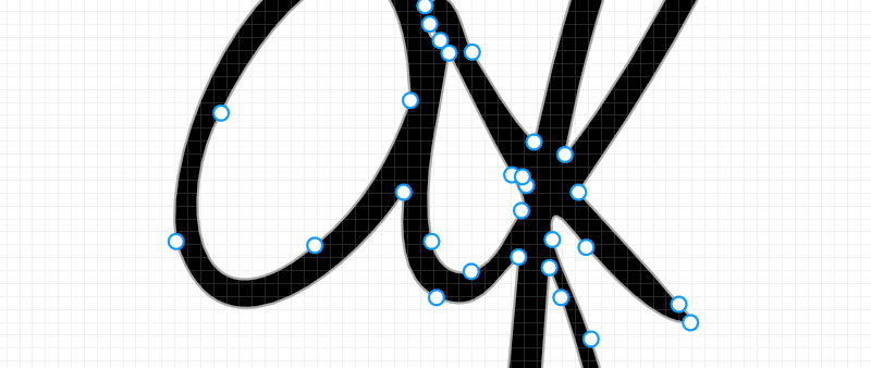
My original logo comes from around 8 years ago, I draw it with a pressure-sensitive pen on my Surface Pro 4. It was used as a temporary placeholder for the portfolio I was trying to build at that time. I later image-traced it with Adobe Illustrator to get the SVG version. Surprising to recall, it has been so long since then.

Rework the Logo #
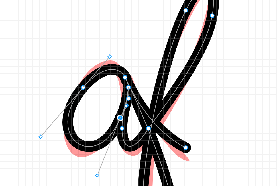
As we see, the animation is done by moving the dash on strokes, while my Logo is a vector outline with multiple control points. So I need to redraw it with a single stroke. It took a bit of practice to get used to the pen tool, I managed to make it with Figma.

Manually adding the styles in the exported SVG,
@media (prefers-reduced-motion) {
  path {
    animation: none !important;
    stroke-dasharray: unset !important;
  }
}
@keyframes grow {
  0% {
    stroke-dashoffset: 1px;
    stroke-dasharray: 0 350px;
    opacity: 0;
  }
  10% {
    opacity: 1;
  }
  40% {
    stroke-dasharray: 350px 0;
  }
  /* Moving back */
  85% {
    stroke-dasharray: 350px 0;
  }
  95%,
  to {
    stroke-dasharray: 0 350px;
  }
}
path {
  stroke-dashoffset: 1px;
  stroke-dasharray: 350px 0;
  animation: grow 10s ease forwards infinite;
  transform-origin: center;
  stroke: #303030;
  animation-delay: 0s;
}
now we have a decent animated logo:
The only downside is that the stroke is evenly thick everywhere, making it looks less like a signature. I tried to look for solutions and end up with the Variable width stroke proposal, however, it does not seem to be going anywhere. Well, it’s stroke anyway, it’s supposed to be even. Giving the animation is super cool already, what else can I ask for?
Variable Stroke Width #
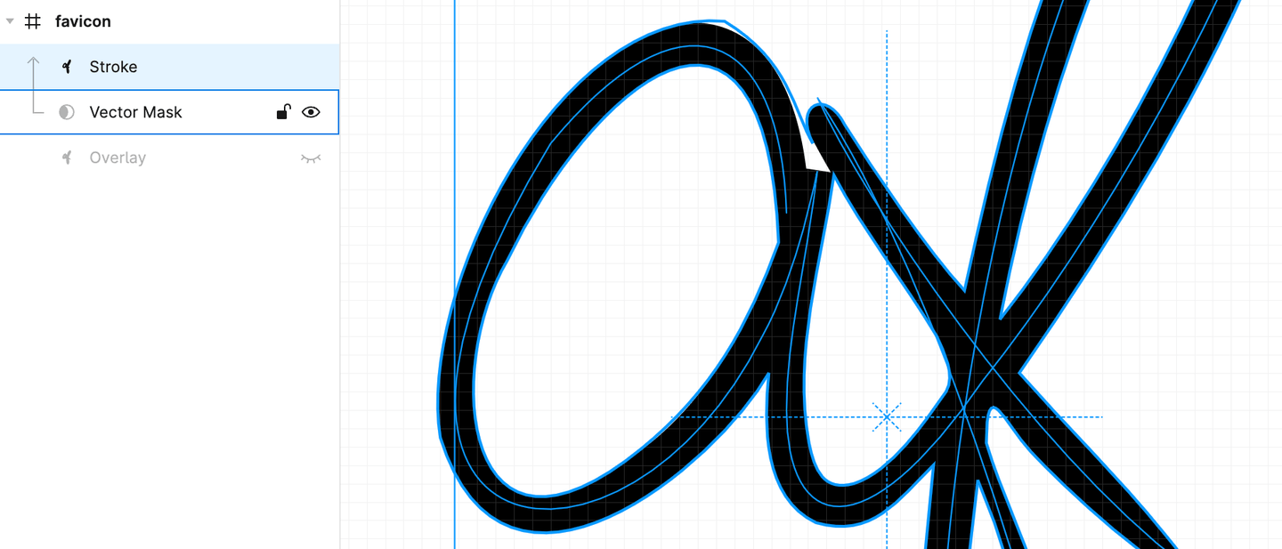
When I almost gave up, I was playing around with Figma to do some final cleanup with the drafts, I suddenly realized that SVG does have mask support. So what if I have the original SVG shape as the mask, and let the stroke animate inside the mask? So I gave it a try and surprisingly it works!

Basically we are using the mask to limit the stroke’s visibility, a trick to workaround the limitation of the stroke width. Note it’s not 100% pixel-perfect, as in the interaction we can’t control the stroke width, so the stroke will be a bit off the mask. We can try to adjust the mask to make it look a bit better, but you will still see a big glitch when zooming in a lot. I guess it might be possible to solve this with multiple strokes and masks, but this one is already quite good to me.
Hope you enjoy the article, and I’d love to see your animated SVG logo too!